
The most common website mistakes on small business sites are slow loading times, layouts that break on phones, confusing navigation and no obvious way to get in touch. Each one sends potential customers to a competitor, usually without a word of complaint.
Most websites don’t fail in one dramatic way. They drift. A plugin gets added, a photo goes up at full size, a menu grows another item. Eighteen months later nobody has looked at the thing properly. Below are the errors I see most often, how to spot them, and what to fix first.
What are the most common website mistakes?
The most common website mistakes are a slow site, poor mobile layouts, confusing navigation, buried contact details and no proof that real people stand behind the business. Of all of them, the biggest mistake small businesses make is assuming the site is fine because nobody has complained. Website users don’t complain. They leave.
Website owners tend to judge their own site on a large desktop screen, with a warm cache, already knowing where everything lives. New visitors have none of that. They arrive cold, on a phone, often in a hurry.
Rank your fixes by business impact. A broken enquiry form costs you work. A slightly off font doesn’t. Put a deadline against each fix, because “we’ll get to it” is how these website mistakes survive for years.
What are the top 10 web design mistakes?

The top web design mistakes we see are the ones that stop a visitor from finding what they came for. Here is the list I’d check any small business site against:
- A site that isn’t mobile-friendly
- Slow loading times from oversized images and unnecessary plugins
- Poor navigation and unclear menu labels
- Broken links and unhelpful 404 pages
- A homepage that doesn’t say what the business does
- Cluttered pages with no white space
- Hard-to-read fonts and low-contrast colours
- Contact details that are missing or hard to find
- No testimonials, case studies or other trust signals
- Missing basics: HTTPS, page titles, alt text and a privacy policy
Any one of these design mistakes is recoverable. Several at once means the website’s design is working against the business behind it.
Why does my website look different on mobile?

Your website looks different on mobile because the layout was built for a wide desktop screen and then squeezed down, rather than designed for small screens first. Fixed-width columns, oversized hero images and long menus all behave differently on mobile devices.
Responsive web design fixes this. The layout adapts to the screen size, so the same page rearranges itself for a phone, a tablet and a monitor. A mobile-first approach goes one step further: you design the phone version first, then add to it for larger screens. Small screens leave no room for filler, so you’re forced to prioritise clarity.
Mobile users make up a large share of visitors for most local businesses (around 52%). A site that only works on desktop turns away real people every day.
How do you test if a website is mobile-friendly?

You test whether a website is mobile-friendly by using it on real phones and running it through Google PageSpeed Insights. Follow these steps:
- Open your homepage, services page and contact page on your own phone.
- Repeat on a different phone, ideally an older Android, plus a tablet.
- Check that text is readable without zooming and nothing runs off the screen.
- Tap every button and link. Tap targets should be at least 44px so a thumb can hit them.
- Run each key page through Google PageSpeed Insights and read the mobile report.
Resizing your desktop browser window isn’t a proper test. Real devices show you what real users see.
How do you fix confusing navigation on mobile devices?
Simplify the main menu and tuck secondary links into a clear menu icon. A desktop menu with twelve items becomes an unreadable wall on a phone.
Keep the two or three things people actually want, such as services, contact and booking, front and centre. Move “Our History” and “Meet the Team” into the collapsed menu. Then check it on different devices, because a menu that works on your phone can still break on someone else’s.
Why is every website so slow now, and how do I increase my website speed?

Websites feel slower because pages have got heavier. Large photos straight off a phone camera, embedded videos, social feeds, tracking scripts and a pile of unnecessary plugins all add weight, and cheap hosting struggles to carry it. A slow site is usually built by accident, one addition at a time.
The common benchmark is the three-second rule. It says visitors judge a page within about three seconds, and many will leave if it hasn’t loaded or hasn’t told them what you offer. Treat it as a rule of thumb, not a law, but it’s a useful target for load times.
What should you do if a website is running slowly?
Measure first, then fix the biggest cause. Guessing wastes money. Work through these steps:
- Measure load times with Google PageSpeed Insights, Lighthouse or GTmetrix, page by page.
- Compress images and lazy-load them so they only load as a visitor scrolls.
- Remove unnecessary plugins and scripts running on every page.
- Enable browser caching and server-side compression.
- Add a content delivery network (a CDN is a network of servers that delivers your pages from a location close to each visitor) if your users are spread across regions.
- If slow loading times persist, look at your hosting plan.
For a Brisbane business with local customers, steps one to four usually deliver most of the gain.
What are some common website errors?

Common website errors show up as numbered status codes and are what a server returns when something goes wrong. The most common website error is the 404 “page not found”, usually caused by broken links. Codes starting with 4 are client-side problems, and codes starting with 5 are server-side problems.
The main 400 errors you’ll meet:
- 400 Bad Request: the server couldn’t understand the request
- 401 Unauthorised: login is required
- 403 Forbidden: access is refused
- 404 Not Found: the page doesn’t exist at that address
- 410 Gone: the page was removed on purpose
- 429 Too Many Requests: a visitor or bot has hit a rate limit
The main 500 errors:
- 500 Internal Server Error: a generic failure on the server
- 502 Bad Gateway: one server got a bad response from another
- 503 Service Unavailable: the server is overloaded or down for maintenance
- 504 Gateway Timeout: an upstream server took too long to reply
If you see 500-series errors regularly, look at hosting or plugin conflicts. They confuse search engines as well as people.
How do you deal with broken links?
Broken links point to a page that no longer exists. They frustrate website users and signal neglect to search engines. Scan the site regularly with a crawler, and fix your top five first.
When you move content or publish a new page to replace an old one, set up a 301 redirect so the old address lands somewhere useful. Then build a custom 404 page with a search bar, a link to the homepage and your most-visited services. It won’t undo the broken link, but the visit won’t end there.
How does poor navigation lose potential customers?
Poor navigation loses potential customers by making them work to find basic information. If someone has to hunt through a “Resources” dropdown for your pricing, they’ll go to a competitor with a clearer main menu.
Keep your key pages within two clicks of the homepage. Label menu items in plain language: “Services” beats “Solutions” every time. Creative labels might feel clever in a branding workshop, but they confuse users who have about three seconds to decide.
Usability testing doesn’t need to be formal. Hand your phone to a friend who has never seen the site and ask them to find your phone number. Watch where they hesitate. That hesitation is your fix list. Repeat the test whenever you make a big change.
Why should the most important content come first?
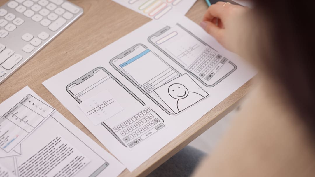
The most important content should come first because visitors decide quickly whether a page is for them. Your homepage should say what you do and who it’s for “above the fold”, which means “without scrolling”.
Put a plain value proposition above the fold. “Emergency plumbing across Brisbane’s inner south” beats “Your trusted partner in flow solutions”. Then make the rest scannable:
- Use clear headings so visitors can find important content fast
- Keep paragraph text to one idea each
- Choose easy-to-read fonts at a sensible size
- Add a prominent call-to-action near the top, not just in the footer
- Leave white space around key elements so they get noticed
Our guide to website features for tradies shows how this plays out for trades businesses that need enquiries, not admiration.
What design mistakes undermine a professional website?
Design mistakes that undermine a professional website are usually about excess, not absence: too many fonts, too many colours and too much competing for attention. A professional website looks consistent, uncluttered and deliberate. White space isn’t wasted. It lets the message get read.
Use consistent branding across every page, and show your contact details on every page, not just a contact page. A site made with a template builder still has to follow these rules of good web design. If you’re weighing that choice, our comparison of DIY website builders and professional web design sets out the trade-offs.
What are the 7 C’s of website design?
The 7 C’s of website design are a checklist some web design teams use. There’s no single official version, but a common one is: clarity, consistency, credibility, content, compatibility, customer focus and conversion. The 7 C’s of a website are the same framework under a different name.
The wording is dated, but it’s a decent prompt to remember. Most of it comes back to one question: can a stranger work out what you do and act on it?
How can you tell if a website is not credible?
A website is probably not credible if it has no physical address, no named people, stock photos in place of real staff and no HTTPS padlock. Outdated copyright dates, broken links and a design stuck a decade in the past add to the doubt.
Three signs a website is trustworthy:
- HTTPS is active and the certificate is current.
- Contact details are real and visible, including a physical address and phone number.
- There is genuine proof: named testimonials, case studies and photos of real people or real case studies.
If you wouldn’t hand over card details on a site, assume your customers feel the same about yours. These website credibility mistakes are also among the easiest to fix.
Which technical and SEO common mistakes should you fix?
The technical and SEO common mistakes to fix first are unreadable URLs, vague page titles, missing alt text and obsolete technology. Search engines can’t see your site the way people do, so you need to tell them what each page is about.
- Use readable, hyphenated URLs such as /services/wedding-photography, not /page?id=4471
- Write descriptive page titles like ‘Blog’, not “From Our Desk” or “Page 2”
- Add alt text to meaningful images, which helps screen reader users and search engines alike
- Remove anything built on Flash, which no modern browser supports
Good web design and good SEO are largely the same job. Our guide to local search for Brisbane businesses covers the fundamentals.
What accessibility, security and legal basics does a site need?
Every business site needs working keyboard navigation, HTTPS with a renewed SSL certificate, and a clearly published privacy and cookie policy. HTTPS is the encrypted version of the web protocol, shown by the padlock in the browser.
Test that users can move through the whole site with a keyboard alone. Put a calendar reminder on your certificate renewal. And if you run WordPress, read our WordPress security guide before something goes wrong, not after.
What is a quick audit checklist for small businesses?

Four things you should do this week as a quick audit check:
- Run a full site crawl to find broken links and missing pages.
- Test performance on mobile and desktop with Google PageSpeed Insights.
- Check navigation on different devices, not just your own.
- Fix your top five broken links straight away.
You don’t need a developer for the first pass. You just need to look at your own site the way new visitors do.
What are the next steps after an audit?
After the audit, you’ll land in one of two places: a handful of quick fixes, or a site that needs more than patching. Fix by customer impact first and search visibility second, then treat redesigns as steady, iterative work rather than a once-a-decade event.
If a rebuild is on the cards, set aside around $5,000 for a well-set-up basic website. Website developers that cost less likely come at some other cost: security risks, plagiarised content, or templated builds as a start. Sites with custom features, higher public scrutiny or a lot of pages will cost more.
Whoever builds it, ask how they use AI. The best approach is human-led, with people making every decision and AI tools helping to tighten security and speed up support. Be careful of designers and developers that exclusively ‘vibe code’; these businesses rely solely on AI to rapidly develop sites and can expose you to unseen risk.
Frequently asked questions
What is the #1 reason small businesses fail?
There’s no single reason, and a website alone rarely sinks a business. Running out of cash and too little demand are the usual causes. A poor website makes both worse by leaking enquiries you’ve already paid to attract.
What types of websites should you avoid?
Avoid sites with no HTTPS padlock, no physical address or contact details, constant pop-ups and no named people. If a site asks for payment details without those basics, leave.
How often should I audit my website?
Run a quick audit every quarter and a deeper review once a year. Re-check after any big change, such as a new plugin, a new page template or a hosting move.
What is the biggest mistake small businesses make with their website?
The biggest mistake is never checking the site as a customer would. Open it on your phone, time how long it takes to load and try to book. The problems show up fast. If you only act on one point in this article, make it that one.